5 Easy Tips For Improving Your Client Experience
May 29, 2024
No matter what kind of business you run, client experience is everything. Because the experience clients have working with you determines not only whether or not they leave a glowing review at the end of their experience, but also whether or not they refer you to everyone they know AND come back for more themselves.
And that’s why creating a good client experience and continuously improving your client experience is ridiculously important.
So, if you’re looking for a few quick tips for ways to improve your client experience, keep reading babes.
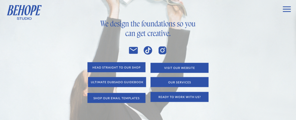
#1 – Ditch the linktree
Fun fact: your client experience starts before someone actually signs on to be your client. In fact, it begins the second someone comes across your business for the very first time.
Which often happens on Instagram. And then that someone, if they’re loving your posts and are curious to learn more, will click on that link in your bio, and that’s when they might be hit with a horror…
A LINKTREE PAGE. AH!
Okay, but seriously, your link in bio page is one of the first touchpoints in your client experience—and it’s super important for that bridge between your social media and your website to feel like a seamless transition. And a Linktree page doesn’t allow for a seamless transition because it can’t be customized to use your branding.
(Which might make someone X out because they fear they’ve clicked on the wrong link since it doesn’t match what they were seeing on Instagram.)
Instead of using Linktree, just add a page to your website (and if you’re using a website platform like Showit, the best website platform ever), you can make your link in bio page gorgeous and on-brand.

#2 – Switch from Google Forms
The truth is, Google Forms don’t make the best impression on potential clients.
And I’ll just go ahead and be painfully honest, but if I have to fill out an enquiry on Google Forms to work with someone, it makes me think twice about hiring them.
Because not only are Google Forms unable to be customized to be on-brand and can’t be embedded on your contact page—meaning that an interested client has to click out of your website to fill out an enquiry form—but it also signals that your services may not be high-ticket because you aren’t prioritizing your client experience.
And while that’s totally unfair, it’s also true.
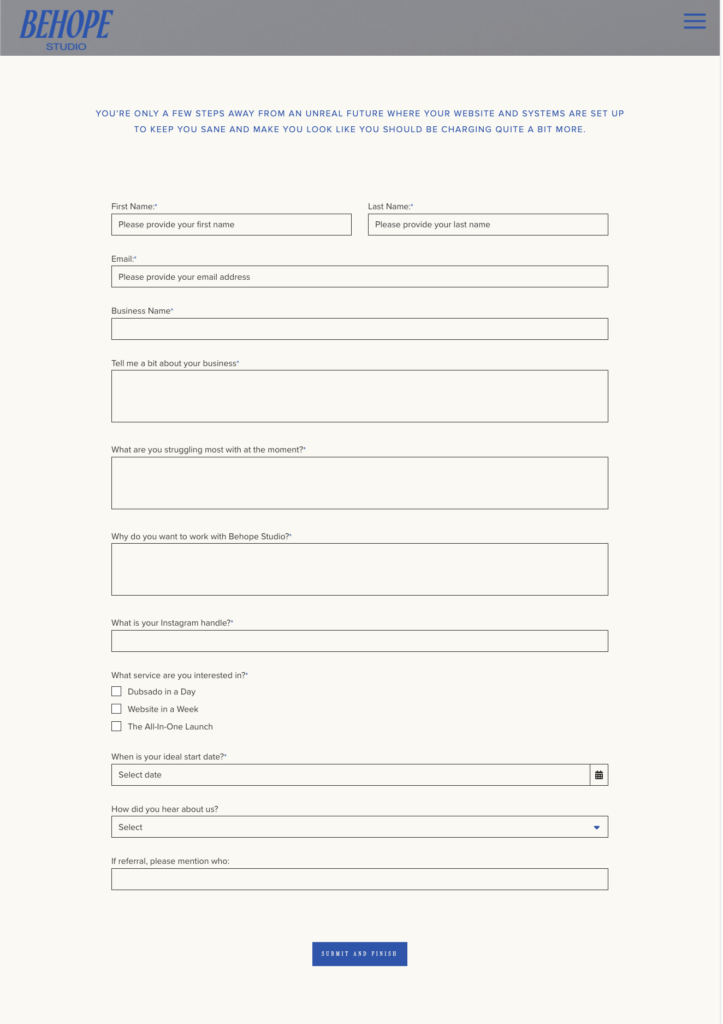
That’s why the 2nd tip for improving your client experience is to use a CRM like Dubsado (the best platform for creative business owners, in my opinion) and to use their enquiry form.
You can customize it so it looks on-brand and embed it on your contact page itself so the experience of filling out an enquiry form is seamless for potential clients.

(Plus, with Dubsado, it’s easy to automate follow-up emails and that’s a great way to improve your client experience, too.)
#3 – Set up an automatic enquiry response
Have you ever enquired with a business or sent an email to customer service and gotten no immediate response? And as the days passed, you’re left wondering, “when in the bloody hell are these people gonna get back to me?”
Or worse, “did I do something wrong? What if my enquiry/email never went through at all?”
Well, a great—and easy—tip for improving your client experience is to set up an email response that gets sent immediately after someone enquires. This doesn’t mean you have to say yes to every person who enquires, rather you’re letting someone know you’ve received their enquiry in the first place.
And that automatic email response might sound something like:
“Hey So and So,
Thanks for reaching out. I wanted to let you know I’ve received your enquiry and I’ll get back to you within X amount of days to chat next steps.”
(But, also don’t be afraid to have a little more cheeky fun.)

P.S. If you’re interested in learning more about automating your enquiry workflow, using Dubsado CRM… you can download my freebie and learn how to set up an your enquiry workflow! Read this blog post, that walks you through the first few steps! Or check out the Dubsado Workflow Blueprint that walks you through setting up your enquiry, onboarding, and offboarding workflows.
#4 – Fancy up your proposals
A fun way to improve your client experience? Spend a little time fancying up the proposals you send to potential clients.
Which will also help you book more clients because when someone who is interested in working with you receives a beautiful and on-brand proposal that makes you look like you’re well-worth the prices you charge, they’re far more likely to hire you.
A few ideas for fancying up your proposals:
- Add in your brand colors and fonts
- Add a personalized video that walks them through the package you recommend, explains your add-ons, and shows them how to move forward (all it takes is embedding a video from a platform like Loom!)
- Add a rave review from a past client
- Add a section for add-ons (hello, upsells)
- Break down your timeline
- Sprinkle in some stunning brand photos
Here’s an example of a beautiful proposal I designed for one of my Dubsado clients:

#5 Include project update emails
Ever ordered from a pizza company called Domino’s (or honestly, any online food delivery system)? Because if you have, you’ve probably obsessively checked the tracking system that updates you as your food is being made, shows you when it’s en route to your house, and notifies you when it’s finally arrived at your doorstep.
And customers go ballistic for these updates because it means they don’t feel kept in the dark about what’s happening after they’ve handed over their credit card.
And even though you’re probably not selling pizzas, a great way to improve your client experience is to do what Domino’s does…
But instead of updating customers on the time estimate for their pizza delivery, you want to keep your clients informed on what the hell is happening with their project.
And that might look like sending an email after…
- Your kickoff calls to share what happens next
- Throughout their project, letting them know what you’re in the process of working on (for example: if you’re a copywriter, you might give clients a weekly update about which stage of drafting you’re in and the research you’re doing)
- At the end of the project, to let them know what next steps they’ll be taking on their own
(Oh, and pro tip, set these emails up to send automatically, so your clients are always kept in the loop without you having to constantly remember to manually share updates with them.)
Want more help with improving your client experience?
That just so happens to be what I specialize in. In fact, I can help you with both your questionnaires, and your link in bio page, and your proposals, and your project update emails, too because… I offer Showit website design and Dubsado setup services.
(It’s like the peanut butter and jelly sandwich for frontend and backend client experience setup).
And if DIY is more your style, pop into the Behope Studio shop. There you’ll find all kinds of useful resources for improving your client experience on your own.